Published
Let the image do the talking
Last week I was at I Heart Studios in Amsterdam to photograph a project that has been in the works since April: a series of design prototypes for the Food industry using sustainable packaging.
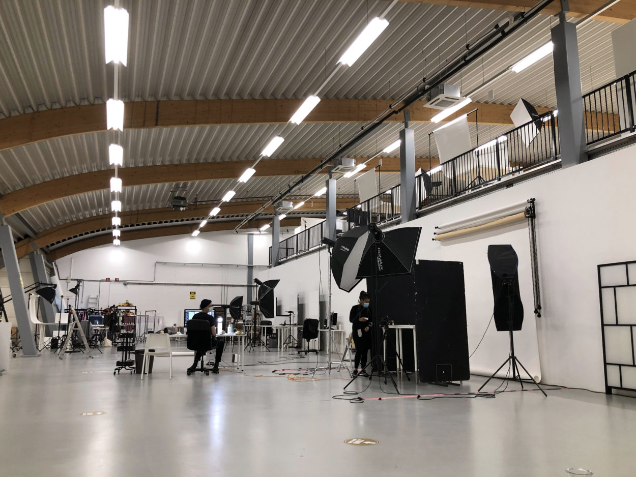
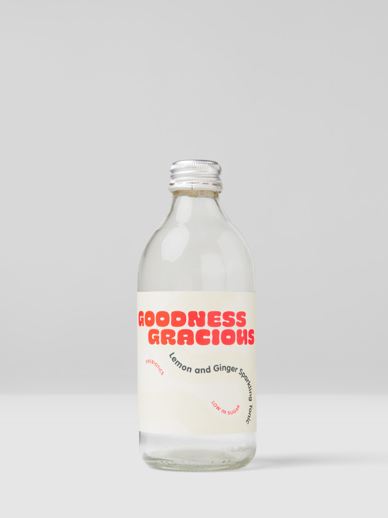
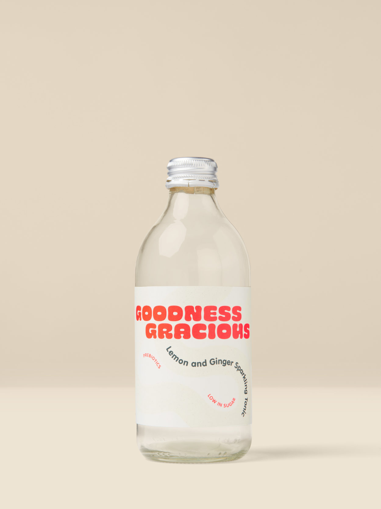
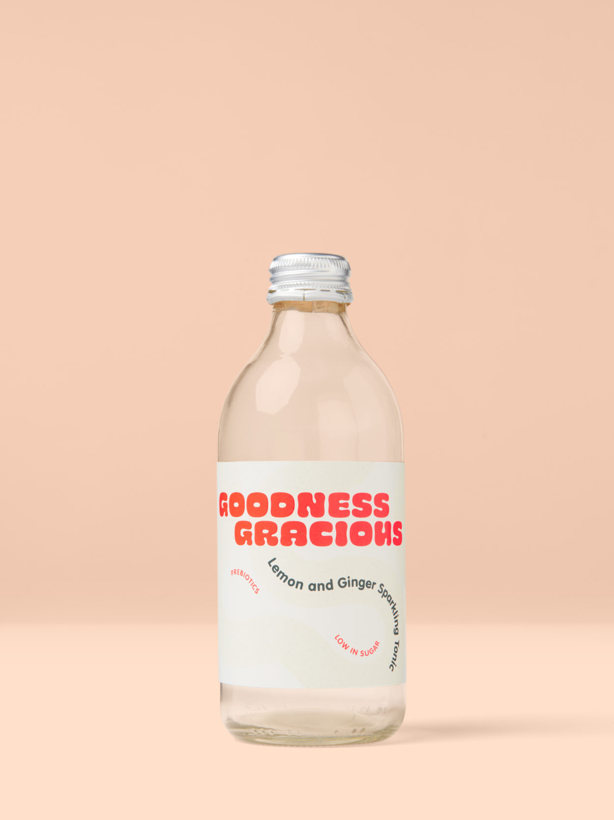
From the outset I was really impressed with I Heart’s professionalism. In particular, their proposal outlined responsibilities (ours and theirs) throughout the process (clarity on a platter! ?? ). We met in person to discuss the detailed brief I’d developed, which was followed by a half-day test shoot to determine final shot list, camera positions, lighting and background colour. Curiously, their standard practice is to insert a background colour in post, rather than shoot with a paper background, as it provides control of colour reproduction and better consistency between shots. Meanwhile, my colleague MP and I shared responsibility for sourcing all of the necessary props – from vessels to fresh food to blank label sheets and rolls to representative source material.
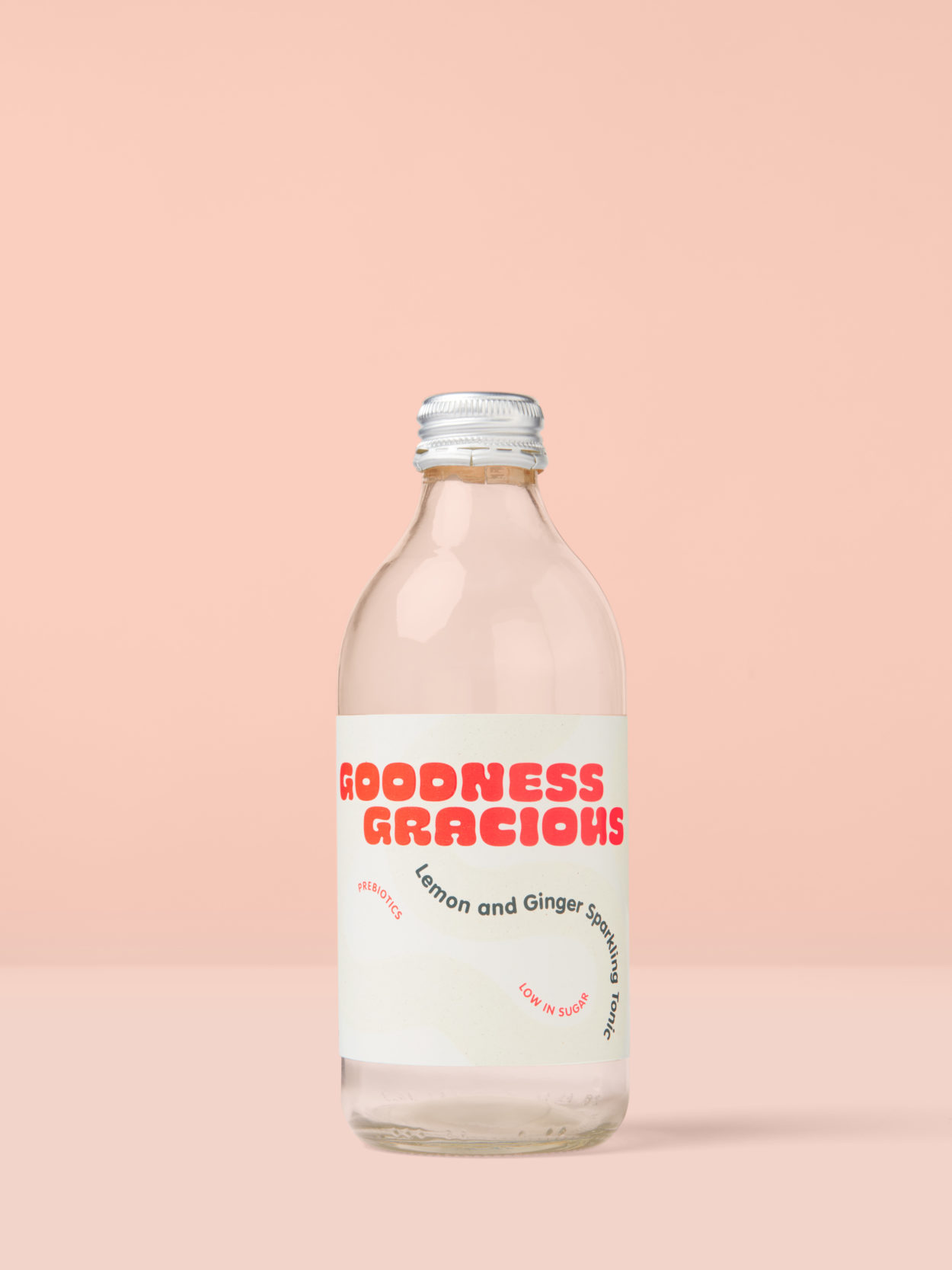
Over the last few years, a number of ‘envelope’ collections have been made by Avery Dennison for the Wine and Spirits segment. The materials featured are typically premium with strong aesthetic qualities. Hence, the photography focused on design, texture and print finishing.
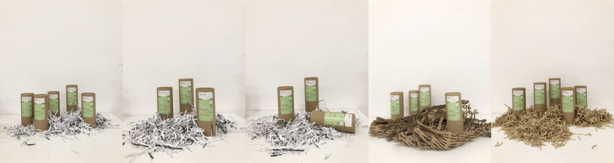
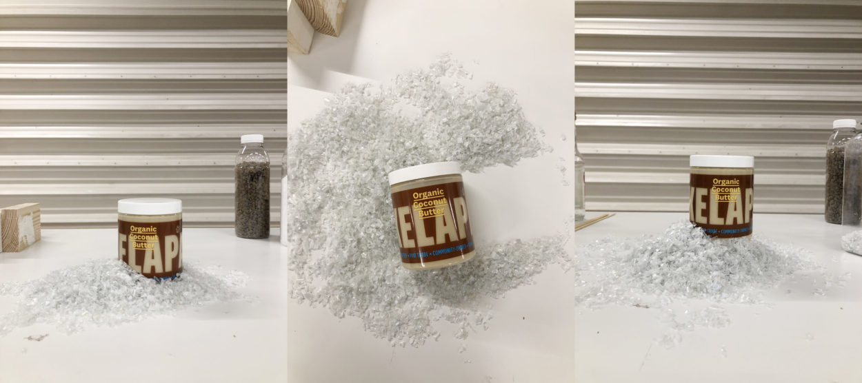
In approaching this shoot, I wanted the images to play a pivotal role in telling the story of the sustainable materials featured – in relation to their material composition and performance capability. For example, rMC, made from FSC-certified paper and 30% post consumer waste, was propped with shredded newspaper and office copy paper. While rCrush resists rupture or significant change in appearance when wet, so was sprayed to show water droplets on its surface.
The propped compositions were developed very intuitively to the side of the set while other shots were wrapping up. Iteratively, I physically composed the prototypes and props, capturing each composition on my iPhone, until I had a rough idea of what looked best.
Given our tight deadline, retouched images were shared in batches as they were finished. Most of my retouching notes related to colour reproduction, prominence of texture and print finishing and removing visible air bubbles that were present due to manual label application.
In future, it would be interesting to push the image direction further again, so that the compositions are less conventional – feasible given the next envelope is for the Beauty segment. I’d also like to compose a bit more intuitively, and rely less on references, which will be more doable now being located in the Netherlands.
The photographer and stylist were very responsive to feedback and patient with me pushing until we got every last shot right. There was a bit of miscommunication regarding retouching, so I would clarify upfront when and where any background colour might appear, in addition to reviewing the photographer’s retouching notes before they get sent to post-production.